![]()
Mapping data outside normal geography.
Sometimes we have location data which isn't related to large scale geography such as countries, or continents, but much more local and small scale such as within a store, warehouse, or even within an object, such as a car engine.
Being able to see this data visually within the location it exists can be just as enlightening as looking at data within a conventional map. See below for examples ;
Here we see "widgets" (as a random fictional example) plotted as points on isles in a supermarket. The point is located where the product is stocked in the supermarket, and the point size is based on the number of widgets for that groupp of products. The key reveals the actual product type of each point ;
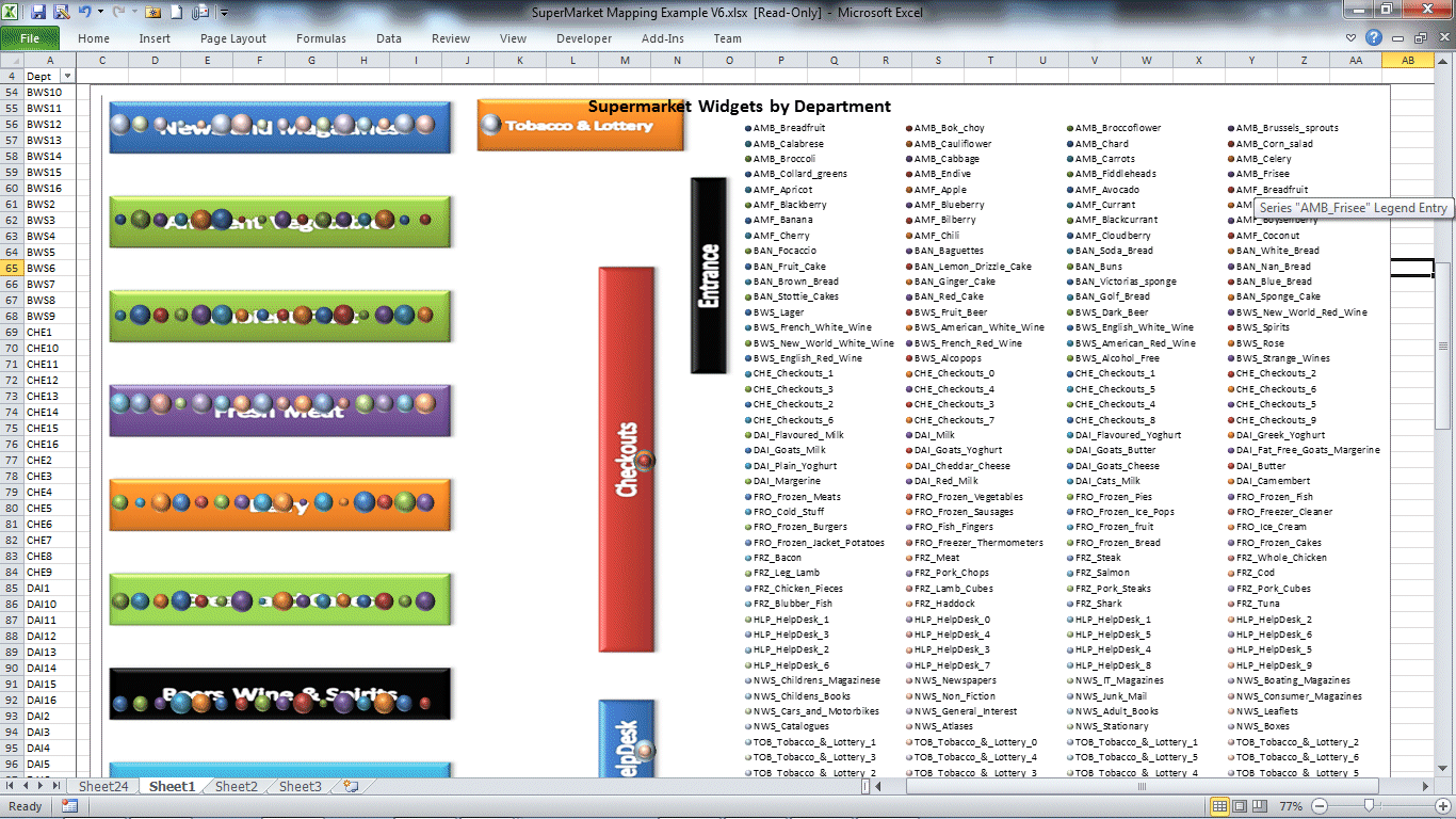
The options of the Location reference tool allow the map location data to be changed to point to a different source. In the other examples shown, a store number links to a location on a map within the UK. In this case, a department code maps to a location within the supermarket. The map itself has been changed from a map of the UK to a simple representation of the isles within the supermarket. After setting up the image for the new map, and setting up the department to location references, simply by a couple of clicks, the tool can be reconfigured to work with this data, enabling all of the feature rich tools of the location refence and mapping tool to this style of data.
In the example below, a different style of map image has been applied to show how simply the appearance can be changed ;
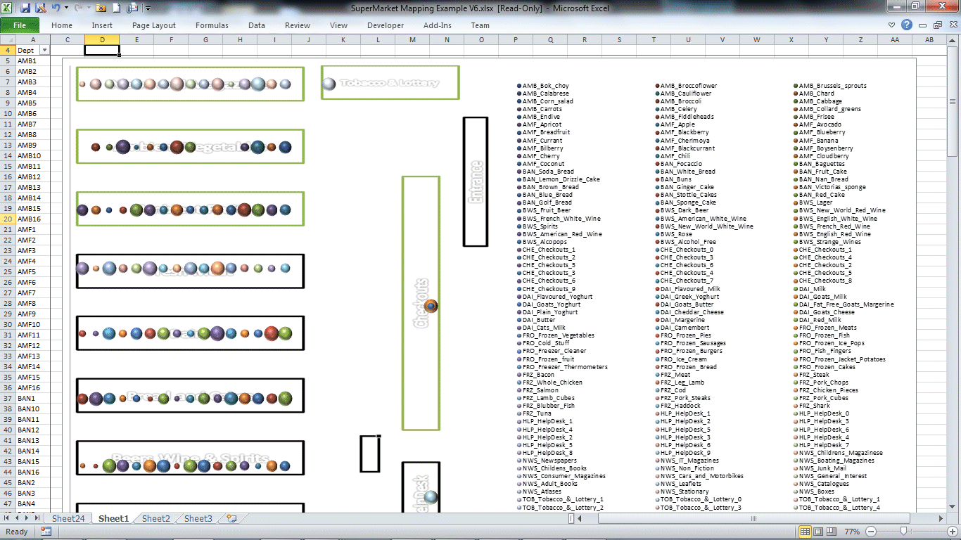
Of course the quick reference tool can be used simply against the department codes above, so with any given cell selected, I could see all of the information relating to that department simply by the click of an icon.
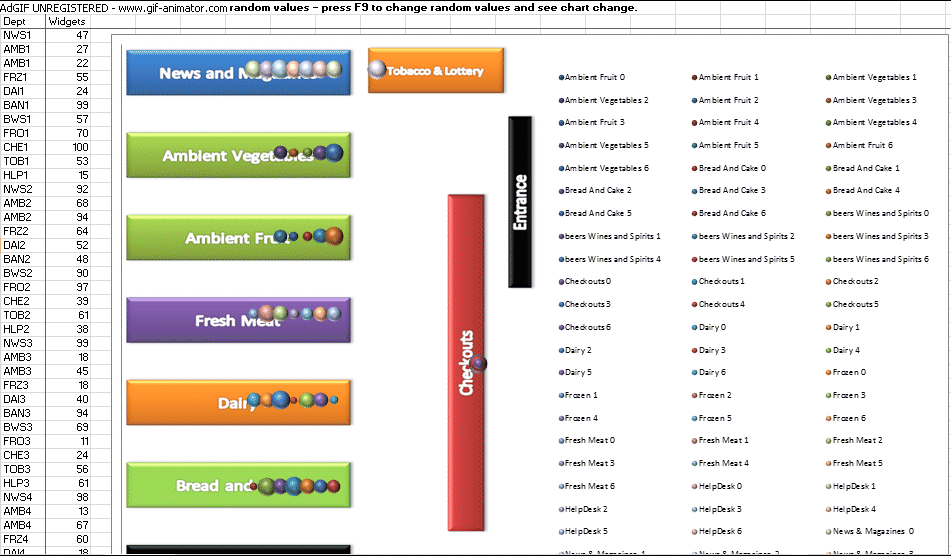
As mentioned above, all of the rich features of the mapping tool can be applied against the new location data and map image. The example below shows how the spreadsheet has been set up with random numbers against each department code. The first time the data was selected, and the map set up, the random "widgets" were selected to represent the point sizes, the mapping data was selected to be placed on a new worksheet (as we didnt want to see that data), and the map itself was defined as dynamic, so that when the excel data changed, the map automatically refreshed.
So each time F9 (calculate) was pressed in Excel, the random numbers changed and so did the map ...
The example below shows visualisation of heat within components of a car engine. The individual components of the engine have been mapped as points on the image of the engine with the reference information. Seperately I have data which shows the individual components, the average heat which gets generated within them, and the radius that the heat permeates (e.g. as a measure of insulation). When I map the components onto the image, I add that I want to add bubble sizes according to the heat radius (showing the spread), and heat map the colour of the points according to the heat generated. See below for the example ;
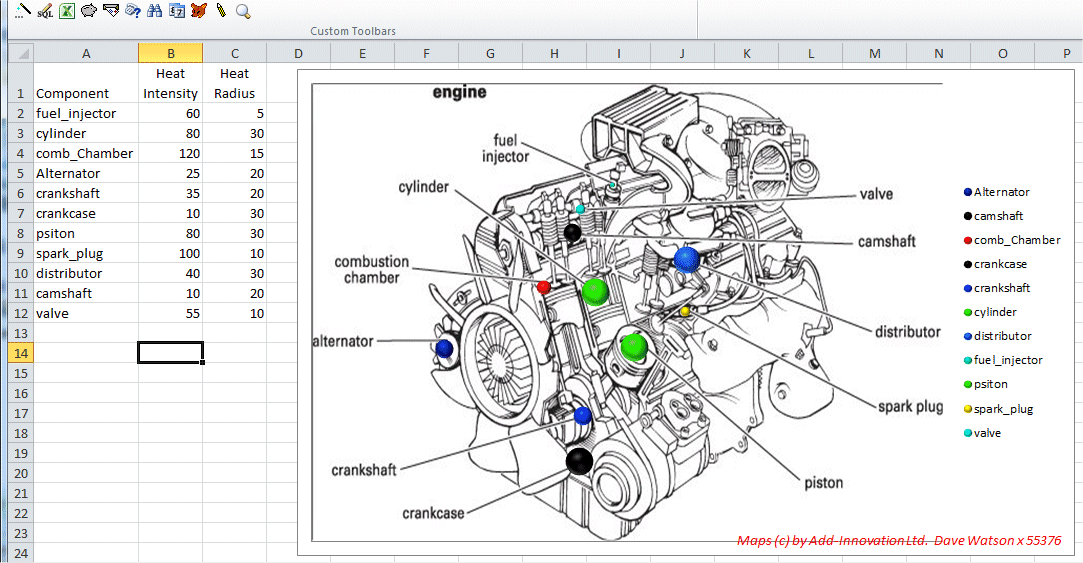
Mapping the points on the image is easy, as a seperate form allows us to run through each of the components (or for any other data, each of the identifying columns), and locate where that item is on the image or map. It even allows us to remap points if we find they are in the wrong location, or to work out calibration factors to adjust point location factors so that they fit into an image. For example, I have map northing and easting co-orinates for my data, and can map them onto a map image, but if i choose a new map image, the locations will need to be factored so that they fit into the correct true geographic locations. Click here for more details.