![]()
Excel provides the freedom to work with almost any data, but generally we work with numbers. Our numbers can be formulated, patterned, progressive, or even random. Getting a feel as to how our data is spread and organised (or not), is often best done visually - by plotting our data. This is especially true since we can only see about 30 rows of data on the screen at one time, but Excel allows up to 65,535 rows. There are many different ways in which statisticians display data, but the most common two, which tell us a great deal about our data in one view, are the distribution chart or plot, and box and whisker plots.
This kind of analysis shouldn't be confused with the question "What shape is my data in ?", where we would probably be looking to check the integrity of our data. Add-innovation provides the data integrity checking tool to cater for this.
As an example, the following analysis was based on 2,000 random numbers generated for a normal distribution with a mean of 50, and standard deviation of 10 (generated using the Microsoft Excel “Analysis Toolpak”). The data is displayed using the Tesco Toolbar "Data Anlaysis" tool. This tool allows you to select a range of cells, then quickly generate summary statistics, a distribution table, a distribution chart, and box and whisker plot to represent your data. The tool becomes interactive in that it allows you to change the parameters of the distribution table, and plot, allowing you to dynamically examine your data. The results can be captured to display on your spreadsheet.
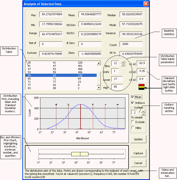
The distribution graph shows the hallmark “bell curve” shape, showing a standard “normal distribution”. The hypothesis that the data is also normally distributed is strengthened by the Kutosis value of 9.8. Because of these facts, we can see that the data falls into this shape, we can make various assumptions about the population of values which make up this data.
If we can logically assume that this sample of data is representative of a broader population of data of the same type, then we can also logically assume that larger or smaller population will have the same, or similar characteristics. We can also test this hypothesis using different samples of data using the same elementary statistics.
For example, if we measure the heights of all employees in the same company, we will generally find that most people fall around an average height, with few who are especially short or tall. If we plot the distribution of those heights, we will almost certainly find a bell curve shape of the distribution. We can assume that the standard deviation, and mean will be similar within smaller samples of the same employees.
This is especially true with the Standard Deviation from the mean, where we would expect 68 % to be within ± 1 standard deviation from the mean, 95 % to be within ± 2 standard deviations, and 98 % to be within ± 3 standard deviations.
The second chart shown is the box and whisker plot. The box is centred around the median value of our data. This is the middle value of our data that is calculated as the highest number - the lowest, divided by two. The outer bounds of the box appear at the 1st and 3rd quartiles, or 25th and 75th centile - the point where 25% to 75 % of our data lie. The whiskers at the left and right show the lowest and highest numbers. This gives us a very quick view of the spread of our data, compared to where the bulk of our data is - if the whiskers are wide, then we have low and high points which may be outliers.
The chart below shows the distribution of an element of budget payroll across across section of stores.
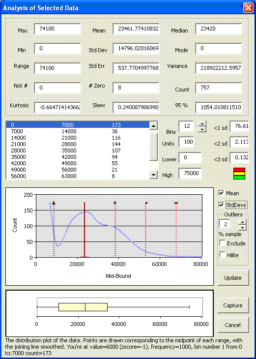
The distribution shows a peak on the left, with a normal distribution following. The peak stores should be considered individually, since their presence is skewing the remainder of the analysis, and it is more likely that the relationship between these data items may interact better together than the rest of the population.
To test this theory, the high band of the distribution table was changed to 7000 – the high band of the peak, and the update button clicked to update the graph. The resulting distribution is shown below ;
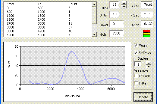
This shows that the peak on the original graph does indeed fall into it’s own normal distribution, and would merit further investigation. Changing the high and low bands again, this time to exclude the data in the range 0 to 7000, changes the distribution plot again, as shown below ;
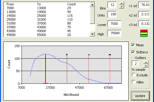
Now we see a distribution with no “tail” on the left (generally an indication that part of the normal distribution is missing, so it could be that some of the data in the range 0 to 7,000 aren’t outliers), but a long tail on the right indicating further indicators.
Outliers can be removed easily by clicking on the “Exclude” tickbox in the “Outliers” frame. This will automatically regenerate the Lower and Upper bounds to exclude the percentage of stores indicated in the percentage box from the extremities of the distribution. Here, the percentage has been changed to 5 %, and the chart redrawn.
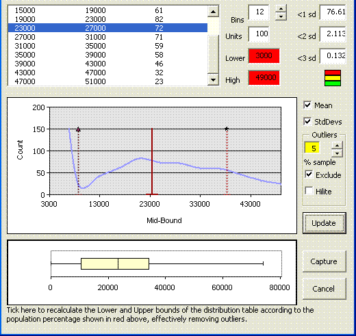
The mouse cursor (not shown) is currently being hovered over the exclude tick box, automatically updating the status area at the bottom of the screen, and highlighting the percentage box, and newly calculated lower and upper limits.
Note that in all cases when the lower and upper bands of the distribution table are changed, the baseline statistics, and the box and whisker plot are not recalculated, and represent the initially selected data.
Here’s another example ; which tests the integrity of the data I’m looking at, or could be used to show in a single click that the data I’m looking at is actually a series of values within given bands. On the data below, I had over 1,000 values which should all fall within values of 0, 1, 4, 9, 16, or 25. Selecting the data, and clicking the analysis option shows …
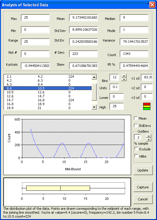
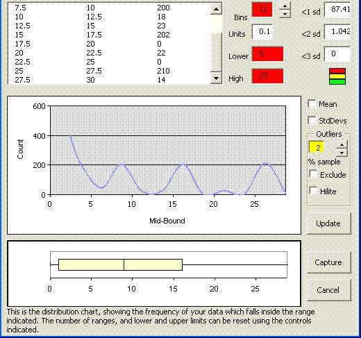
The “oscilloscope” pattern shows me that I have regular peaks of data within given bands. Had I not known that the data was distributed in this way, I could find out in a single click. Conversely if I wanted to establish that all of my data fitted into this pattern, I could verify this in a single click too. Throwing a few random extra’s into the equation, my data looks like ;
Thus this tool can be used quickly to assess the shape of the data, and help to identify if patterns exist in the data. It can also help to identify if the data is “clean” in it’s patterns, or if outliers or rogue values exist.
On a point of data integrity, often data is dependent on some grouping value to identify trends. For example, if we were talking about children’s shoe sizes, grouping the data by age and sex would be appropriate in assessing distributions. In cases such as these, the “integrity checking tool” can help to assess and correct the integrity of data you’re using. Currently this is tailored towards identifying data according to Tesco store number, and grouping data according to the store’s format and group. Contact add-innovation if you’d like a method of grouping data in some other way.